Bright Ideas in the Kitchen
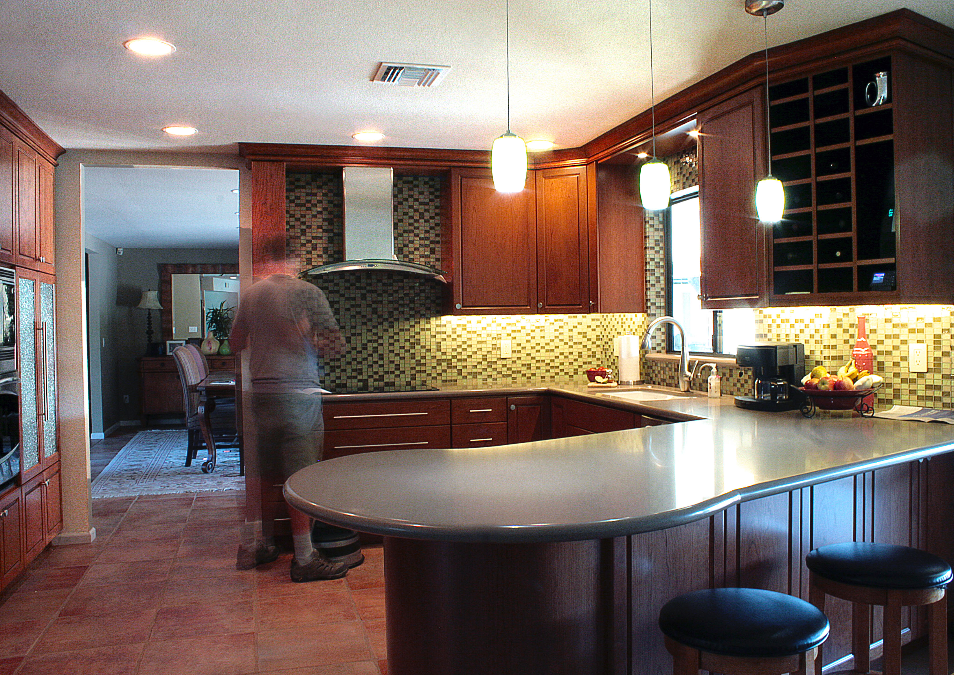
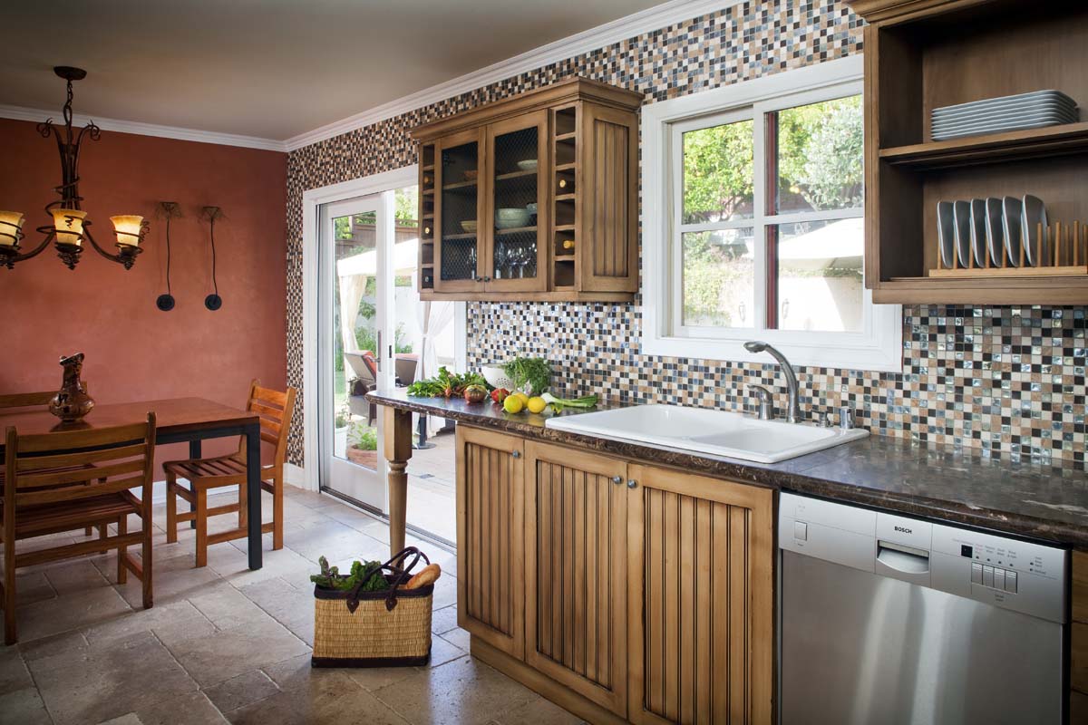
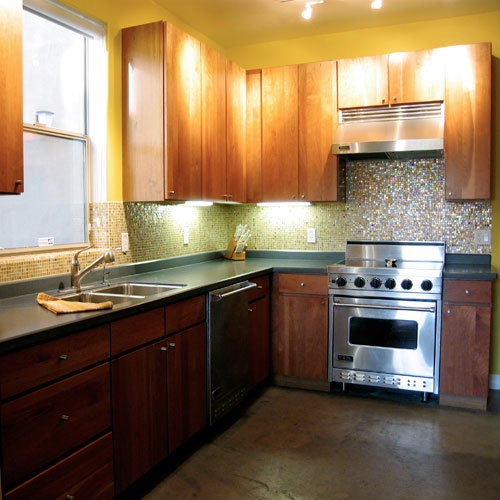
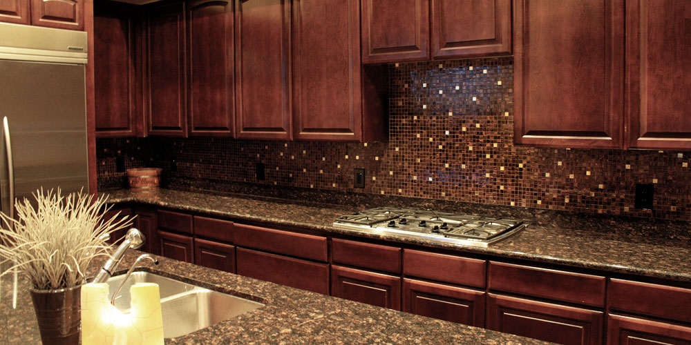
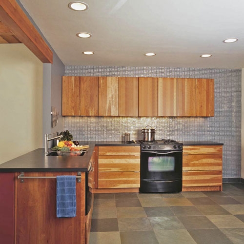
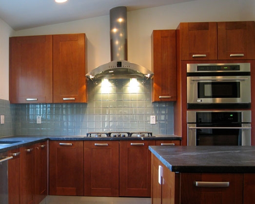
Originally a dark, cavernous space with shadowed work areas, our new design is all about the open feel, well-lit workstations, and materials that merge the artistic taste of the owners with functionality and their busy lifestyle.
So, lets talk about the obvious – We killed the upper cabinets. Modern dish drawers have full extension, soft-closing hardware so all dishes and glassware are safely and accessibly stored below counter height. In fact, the dishes are cleverly located directly across from the dishwasher so that no steps are needed when unloading clean dishes. Genius!
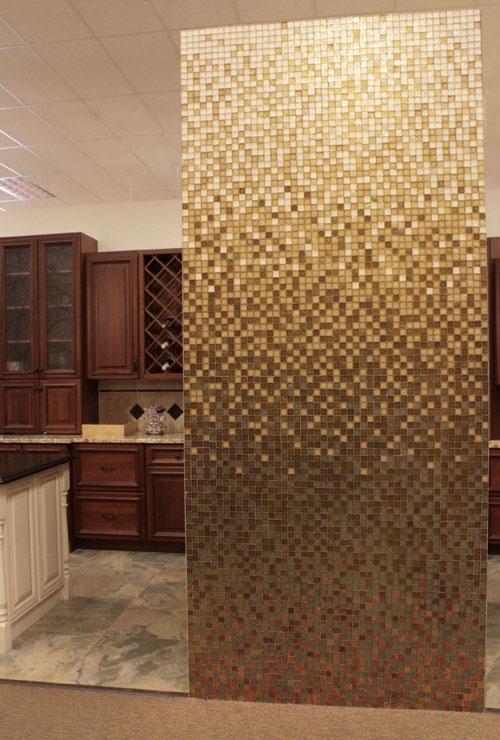
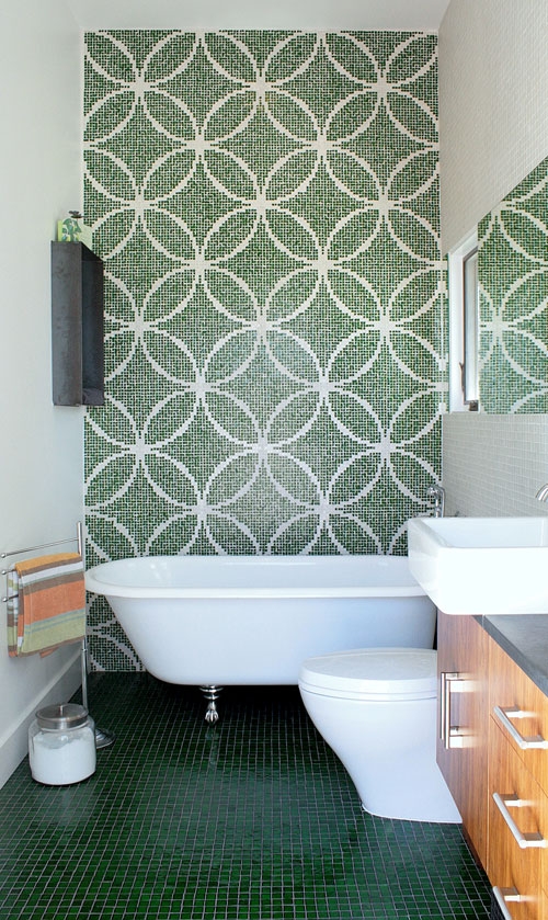
Omitting uppers creates several advantages: First and foremost, all counters become bright work areas. There are 4 well-lit, unencumbered work stations in this kitchen. Second, budget saved on upper cabinets is reallocated to include more dish-drawers, a far more functional use of space than those hard-to-reach top shelves! Third, the backsplash is now a ceiling-height design centerpiece of the home. This is the opportunity to articulate the homeowner’s personality. Make a statement, and pull that awesome design element to other rooms in the home for continuity!
White Countertops – while white counters aren’t for everyone, they are fabulous for those who want to know their kitchen is clean and germ-free – you won’t be hiding any crumbs or spills – Having a pristine backdrop makes spotting messes a breeze, although, if you don’t keep a super clean worktop, a white counter may not be your best choice. In this case, solid quartz with a small white aggregate is pretty much bulletproof – and a large under-mount stainless steel single-basin sink has extra depth and a goose neck spout for efficient washing of cookware of all shapes and sizes.
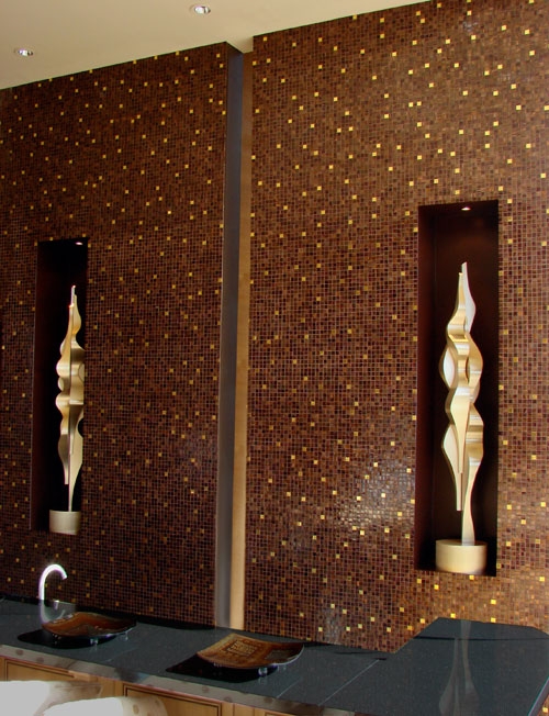
Often, structural elements encroach upon design, and in this case, a structural column intersected the over sized Island. To integrate this as a design feature, we created a wall and added power and lighting such that the dining side became a sweet little bar area and the work side gained additional power and USB ports. It also became a convenient spot to hang cutlery, directly above cutting board storage.

The slide-in range design is an economical way to maintain countertop continuity without separating the oven/range appliances. In this case the electric glass cook top has a minimalist look with easy-to-clean features, although a gas version with burners might be more desirable in a chef’s kitchen. Up to you! Both are available and this particular range from Samsung comes in both orientations, is beautifully stylish, and functions incredibly well!
As far as appliances go, stainless steel is nice for the stove/range hood, but honestly we like the look of black appliances with dark cabinets like these. The dishwasher just disappears. Same with the fridge, and honestly, constantly polishing a bunch of stainless steel is kind of a bummer.
With all the bright light and materials of the workstation/backsplash, dark cabinets provide a solid visual base and these flat-panel fronts are a breeze to keep clean. Low profile hardware keeps the kitchen streamlined, and it’s nice to have long handles on all these dish drawers. Additionally around a corner, a floor-to-ceiling pantry has concealed hardware.
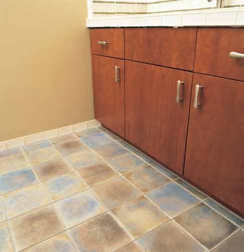
To pull the design together, a medium-light grey 24×24 floor tile is a great backdrop that works with the tones of adjacent hardwood floors. The large format tile is a great choice for minimizing grout joints which need extra maintenance over time.
Have questions or comments about this, and other Alpentile designs? Please contact us at info@alpentile.com or call our in-house designer Amy Denny at 602-541-3065. We’d love to hear from you!


